

Choosing the right frame and mount
When you enter a picture framers for a consultation, deciding on which mountboard and frame choice best suits your work can be quite overwhelming. You’re faced with a wall full of chevron samples and racks of window mount chevrons. A picture framer will know their selection well and can assist you in the process. Of course every picture framer will have their own ideas about what will work. At the end of the day, the matter is subjective, so it’s worth choosing a framer who’s sense of aesthetics align with your own. Particularly if you feel you especially want strong guidance. I’ve come across many framers who are clearly competent at the practical side of their job, but I feel have guided their clients into some pretty horrible design choices! I’d say there’s some hard and fast rules that I go by in helping me decide what works, but once I’ve whittled it down to two or three options, the final decision is mostly intuitive.
Now I’ll walk you through a couple of small works I’m currently framing for my own art collection and show you what options were up for consideration. These are both fairly small works (A4 and A3). As a general rule, I give smaller items larger mount widths (particularly very small items), and vice versa. This sounds counterintuitive, but it aids it in commanding space and attention and helps draw the eye in. Something small with a small mount can also feel cramped in its frame. Larger works however, already command the viewers attention and a mount, although playing a part in the overall aesthetic, its role is leaning more toward the functional.
The first thing I look for as an aid is the palette in the item being framed, second the tonal range, thirdly any textures that we may be able to draw upon, and lastly I think about whether anything ties in conceptually. It’s always best to start with the mount - This is what is sitting immediately next to the artwork so it’s important to get this right first. With the Ryan Mosley screen print being monochrome, we’ve only really got the green of the ink to work with and the colour of the paper.
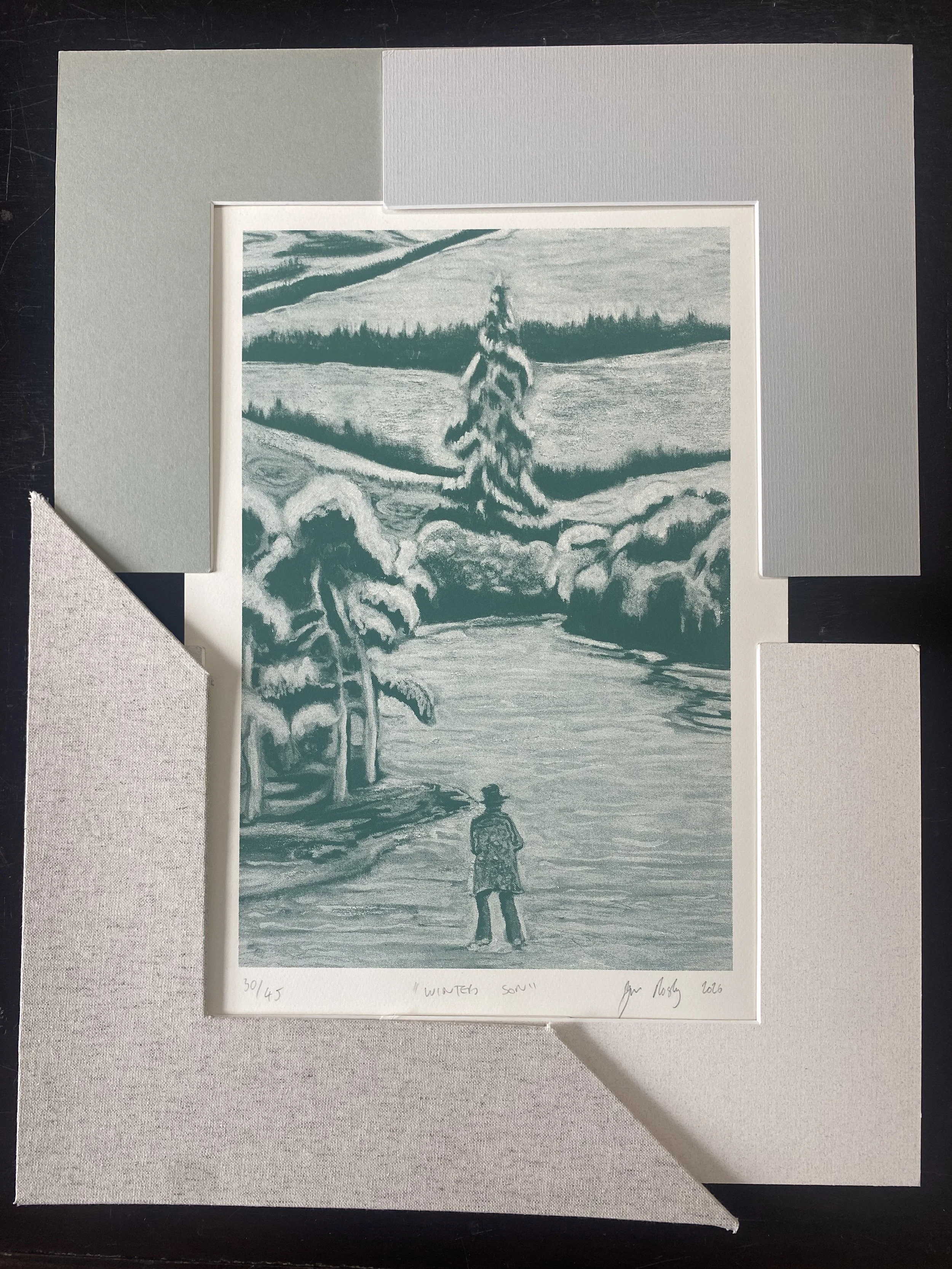
Ryan Mosleys ‘Winters Son’. Limited edition screen print of 50 to accompany his solo show at Graves gallery, Sheffield.
These are the 4 mounts I whittled it down to. I felt that anything too dark around this would be a bit oppressive. It can be practically impossible to colour match, even with the number of mounts I have at my disposal, so it’s worth looking for a colour that is most complimentary. The two I like best are on the left. Either the green, or the hand wrapped linen mount, which brings earthy natural texture. At this point, as long as we have a few options we could potentially be happy with, we can begin to look at frames, which in turn will inform the final mount selection.
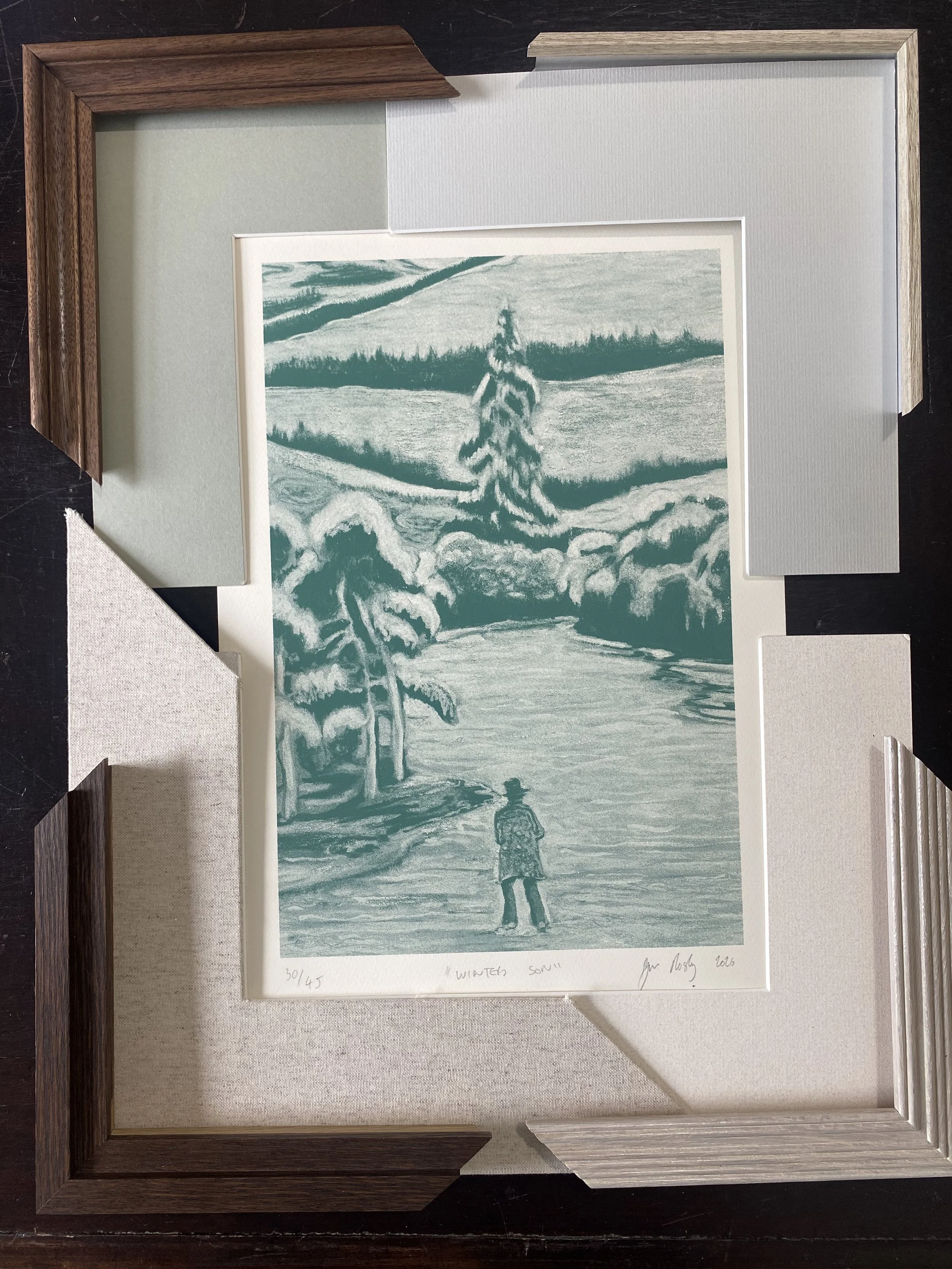
It’s always worth looking at a good range of different frame profiles, widths, colours, tones and textures. They each do something different for the work and they’re all valid and worth considering. Here we have a stepped oak stained to dark mahogany (bottom L), a scooped walnut (top L), a thin aluminium with a real wood veneer (top R), and a reeded oak with a white liquid wax finish (bottom R). Although I was interested in the latter, I felt it just didn’t have enough presence. Although the print is contemporary, it’s rooted in tradition and has to my mind a nod to Casper David Friedrich’s Wanderer above the Sea of Fog. The walnut frame seems to have the seriousness and classic feel required to chime with the work best for me. A natural hardwood frame ties in nicely with the subject matter too.
Moving on to the second work - An original work on paper by Rowan Roberts. I had a fairly strong idea of how I wanted to frame this one. As the frantic activity in rendering the drawing has creased and buckled the paper, I wanted to retain the materiality of it as an object. Rather than window mounting it which would flatten it down, I’m going to float mount it, raising it above the mountboard. This requires a deeper frame and spacer, so this will be taken into consideration.
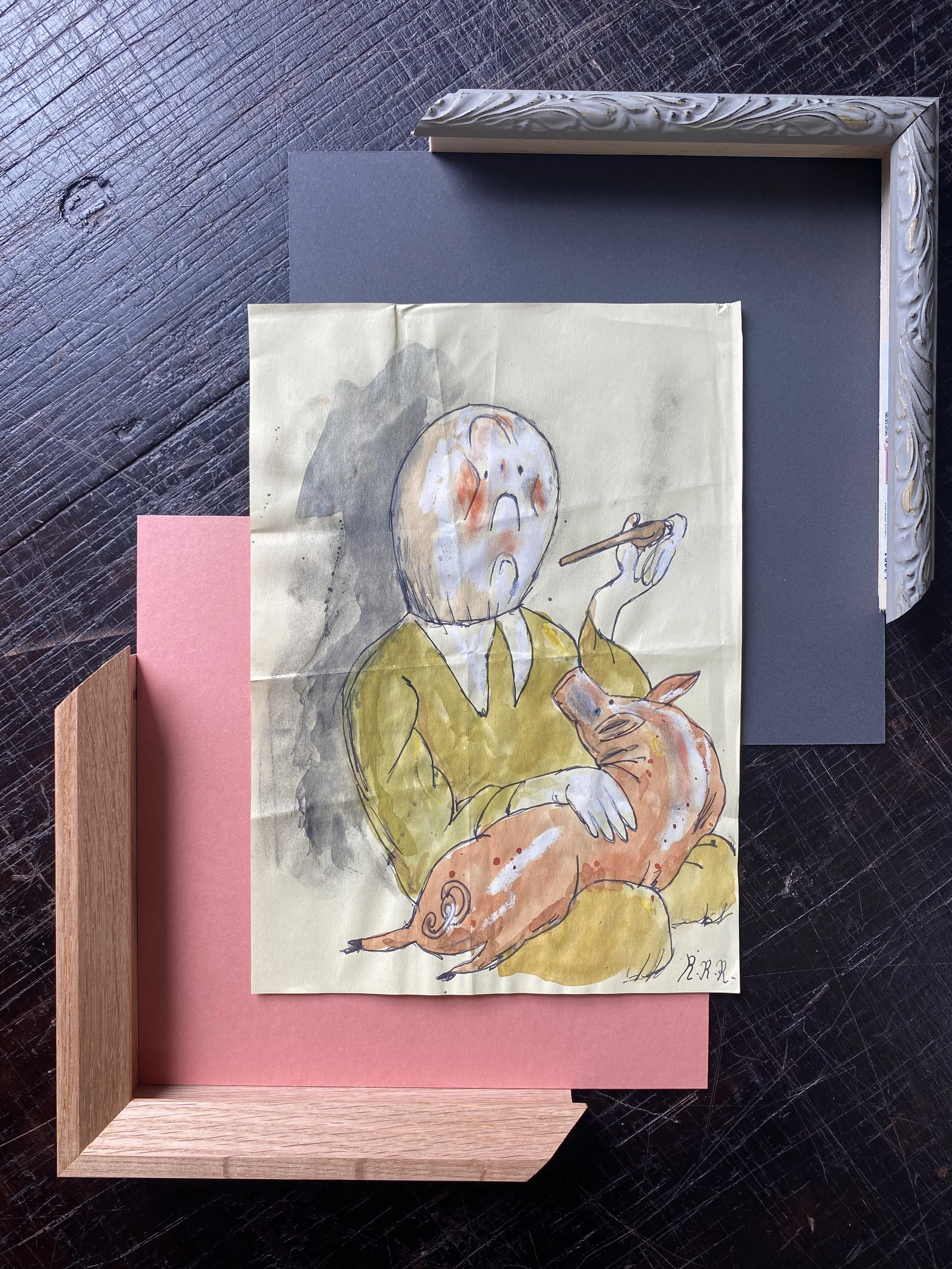
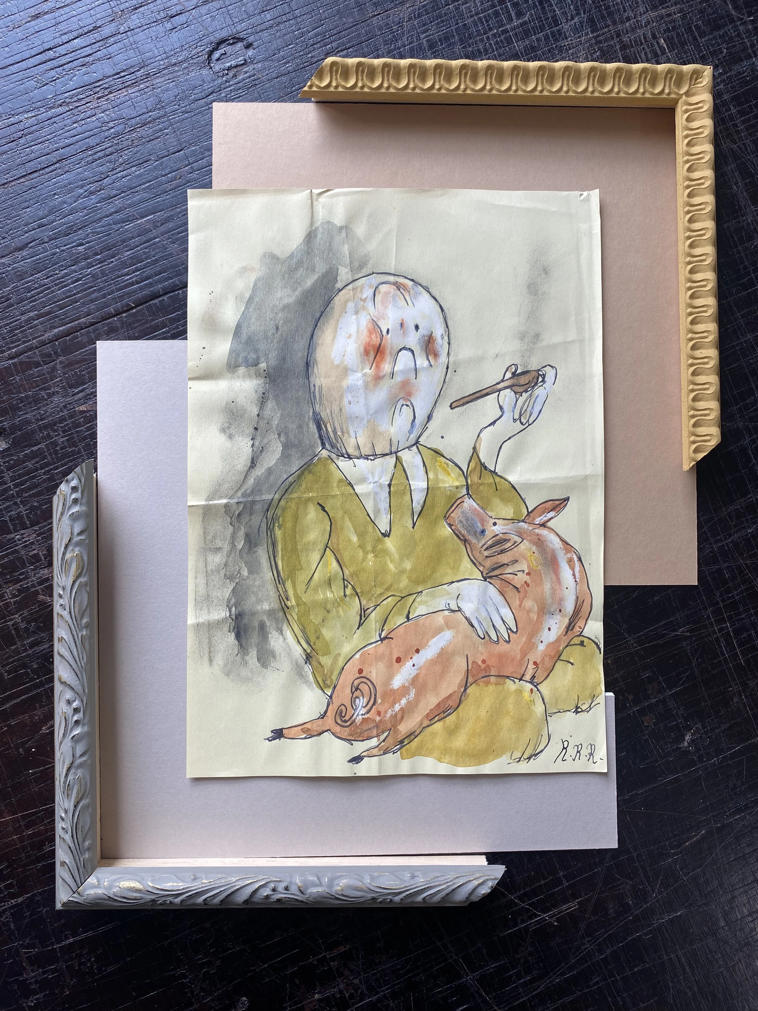
Before looking at samples, I thought I wanted to have some fun with this one. It was in my mind to use the pink of the pig as a motif, however I wasn’t convinced about the pink of the mountboard being right. The only pink I had which was close was the one bottom left, but I find it too strong and overbearing. The oak frame works well tonally, but when I tried it with other mountboards, they just didn’t quite sit right together. The grey floral frame is something I would never have thought I’d be drawn to with this but somehow I think it’s the best suitor, with the pale grey mount. The coolness of that combination let the character of the work shine. My instincts of bold framing here were quashed, but framing is best when it’s not in competition with the work. If you’re drawn to looking at the frame first, then it’s not doing its job properly!